10 Designs in 10 Days
I wanted to challenge myself to design 10 things in 10 days. This was a chance to push myself and design a variety of things over a short period of time. Update: August 23, 2013. So that's 10 Designs in 10 Days. Thanks for all the compliments and visiting the site.
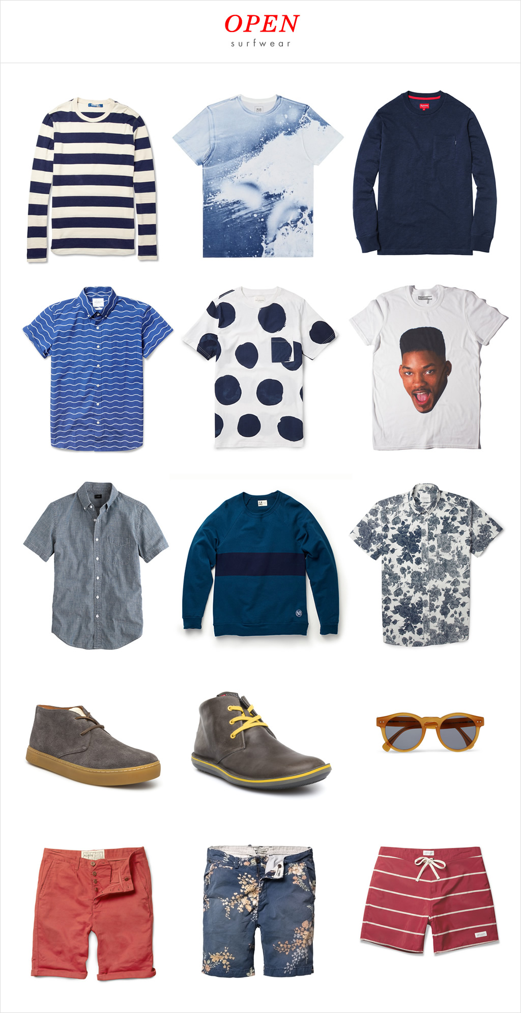
Day 10: Open Surfwear
For a long time now, I've had this dream of starting my own line of apparel. I've talked about J.Crew and Nike a lot here but I'm also inspired by folks from Saturdays NYC, Supreme, Ugmonk, and Johnny Cupcakes. They are relatively small operations but have high quality and great looking stuff.
So for Day 10, I created a brand called “Open Surfwear” that reflects my simple approach to surf clothing. Since I could not design the apparel, shoes and accessories in one day, I spent the time curating different items from around the web, including Saturdays NYC, Almond Surfboards, Supreme, Camper and more, and hoping someday I can design and sell my own line. Why apparel? I 'm always designing user interfaces and so designing physical items would be a different experience.
Disclaimer: All images are owned by the brands I listed above. This is a design exercise for my own learning.
Here's what my collection would look like.
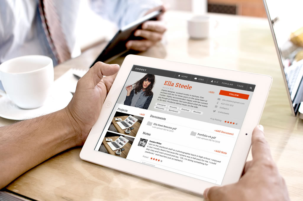
Day 9: Choosy
A few years ago two friends and I created an app called Choosy, an applicant tracking system so hiring managers can direct all their candidates from different job boards into one location. We haven't changed it in years and as you can see from the screenshot on the homepage, the focus of the candidate page is still the resume, which is a very dated view of a person.
Times have changed. Nowadays people's profiles on the web offer more dimensions to candidates, including basic information on LinkedIn, code reviews on Github, creative work on Dribbble or Behance, photography on Instagram or Flickr, and video channels on Youtube or Vimeo. There's also Twitter, Facebook, Instagram, Pinterest, Tumblr, Quora, Readability, their own website and more. Sometimes, one person may have all of the above. Ahem.
Choosy was also designed around gathering active candidates, meaning the main way the app is useful to the recruiter is if candidates fill out a Choosy application form. An active candidate is actively looking for work. This does not necessarily mean unemployed, but it can. A passive candidate is employed, but not currently looking for a new job. What we've learned from our users and our own use of it is that we collected passive candidates, who did not fill out the application form. Usually these are people we know or want to work with someday. We keep our tabs on them in case an opportunity is available in the future.
The following design is the candidate page where I can see all the information about our fictitious candidate, Ella Steele. As you can see, the resume is not the most important element anymore. Projects are now showing plus the notes and comment stream. I'm also introducing tags, which I'm using as shortcuts to the experiences of the person. As candidates can be shared within a company account, I imagine having the ability to follow candidates.
The navigation is also an attempt to help organize the candidates by alphabetical order, popularity, and tags.
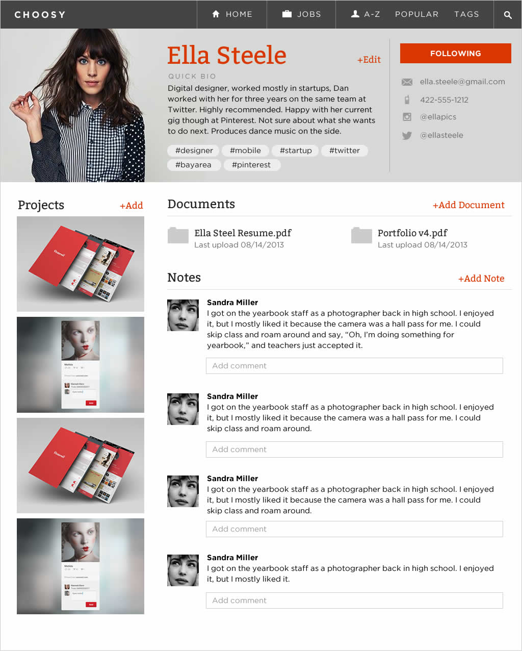
I didn't have time but I wanted the ability to upload video interviews with the candidate so others can see. I also wanted to show the ability to message from the app so we can track that history here. Lastly, pulling in their tweets, FB posts, instagram, Pinterest would be really cool.
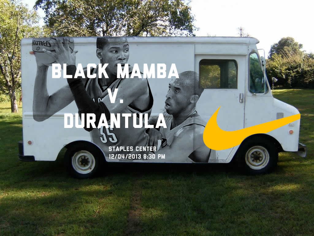
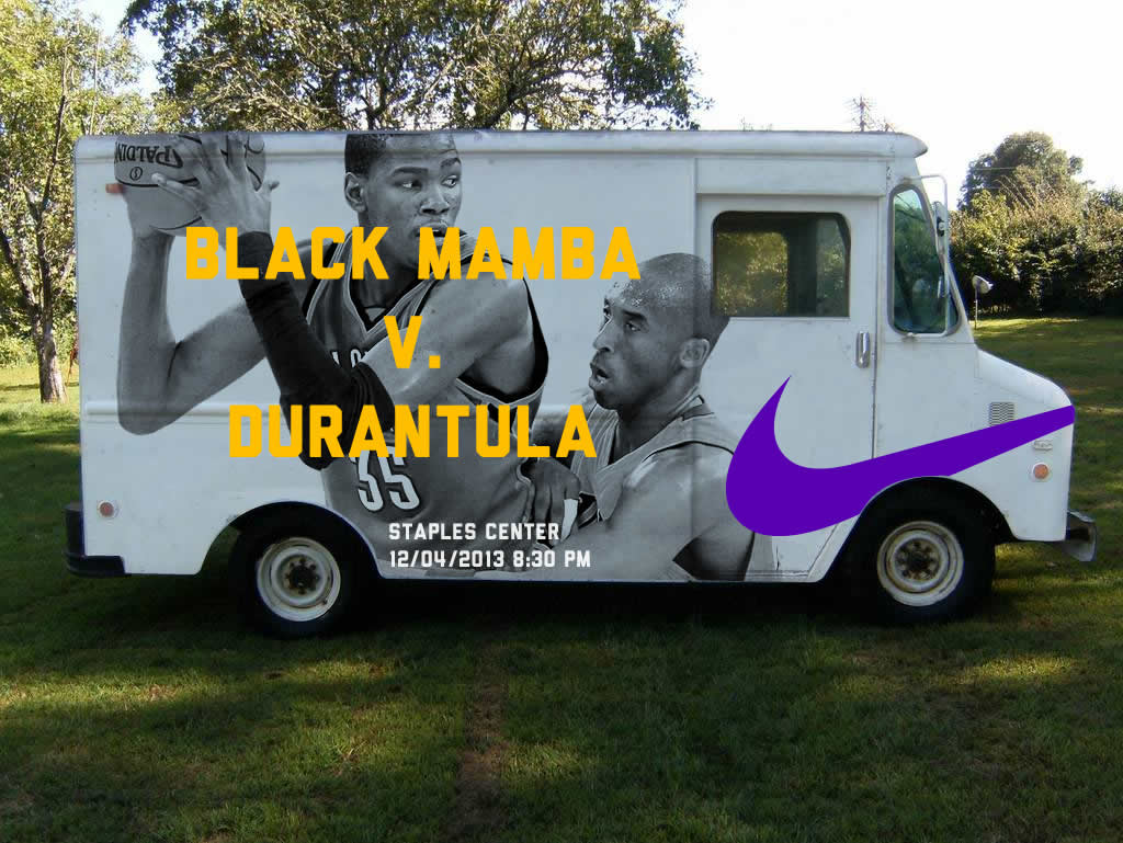
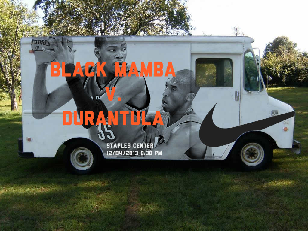
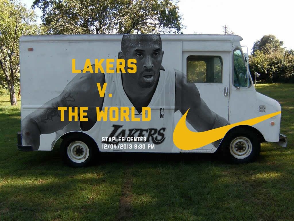
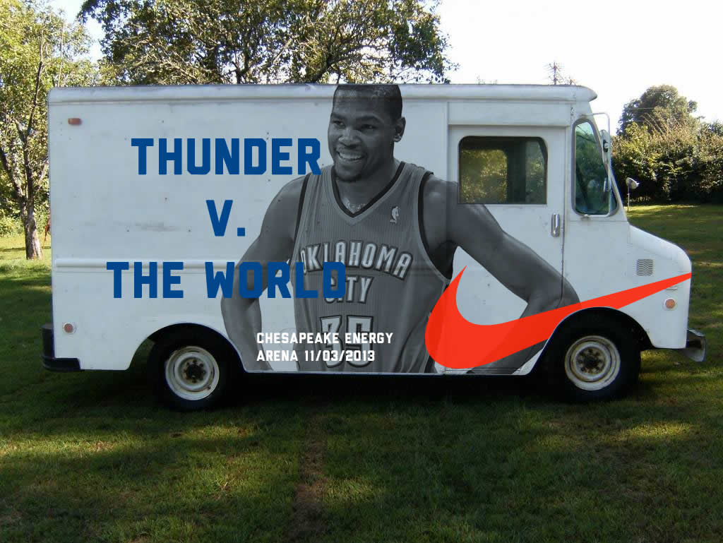
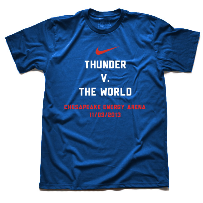
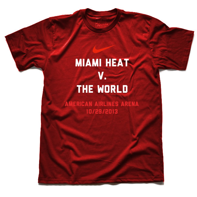
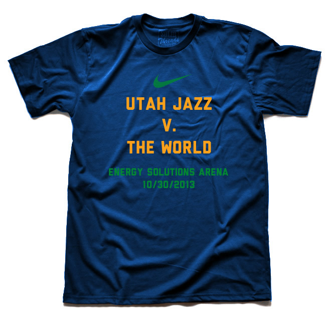
Day 8: Nike Food Truck
I have noticed a trend in retail that's pretty cool: pop-up specialty shops. Pop-up shops are temporary retail shops and mostly experimental in nature. They test the viability of a location without committing years in a lease, most of the time only staying in a location for a few weeks. They're also usually in high traffic places at specific events or season.
My experiment is combining Nike and the food truck to create the ultimate pop-up shop. I imagine them coming to games and only selling items related to that specific game, including t-shirts, shoes, and other apparel. I love the idea of only getting that item because I went to that event.
A disclaimer: Logo, images, and trademarks are owned by Nike. This is a design exercise for my own learning.
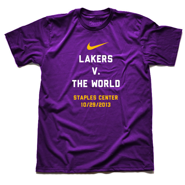
Here are some explorations of the Nike food truck for a specific NBA game. I can imagine Nike going to NFL, MLB, MLS, college games, etc. But never hockey cause that's boring. JK
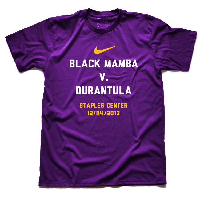
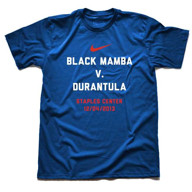
Here are some explorations of a campaign specific to the beginning of the NBA season called “V. The World”.
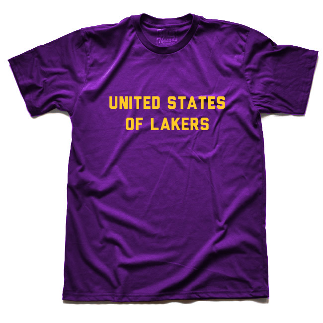
And just for fun :)
Day 7: The Current, News Site For My Daughters
My oldest daughter is an avid reader. According to her goodreads account, she has read 432 books. That count only started when she opened her goodreads account so there's probably more that she hasn't added or forgotten to add to that list. She's 12 years old. (Just to shame her old man, I don't think I read 20 books when I graduated from high school.) She likes to read fiction and real-life stories. She has a subscription to a science magazine and a church magazine, which are both well read. She's slightly interested in current events but it's probably because we don't watch live TV or allow news sites on her computer account.
I want her to continue reading books but now that she's getting older, she will probably want to learn more about what's happening in the world, and will want to participate in discussions and create an opinion. The problem is most news sites are depressing and not targeted for her or her older peers. Online magazines or blogs are hit and miss.
So how can she read current events that are wholesome and appropriate for her age? My solution is an online magazine for kids and teenagers called The Current. It would be a platform with news, photographs and videos. Sections would include current events, culture, literature, fashion, movies, music, opinion, sports, tech, health, arts, and government. It would be curated and edited just like a newspaper. And stories may be republished on The Current if they're appropriate for the magazine.
In order for this solution to work, I need a few things. First, we've set up individual accounts on our iMac so each kid has their own access. They have a password and a time limit each day. We also have parental controls turned on so we can allow apps and websites appropriate for them. I would need to add this website to the "Allowed websites" section. Second, I have a nine year-old daughter who likes to read as well, not as much as her older sister but she's picking up the pace faster each day. I'm imagining this solution has tiered versions (8-11, 12-15, 16-18 years old), including subdomains for better parental controls. Third, most stories need to stay within the site for this to work in our family. I imagine there will be some links to other sites but the site is not intended to be a feed of stories from other news or magazine. Fourth, we have multiple devices at home so it has to work for desktop, tablets, smartphones.
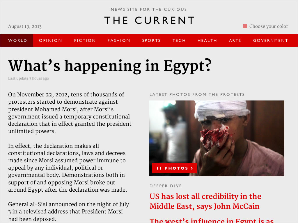
Here's what a specific article would look like on the iPad. The design below shows reports on the current crisis in Egypt with an interactive map of the protests and links to additional stories.
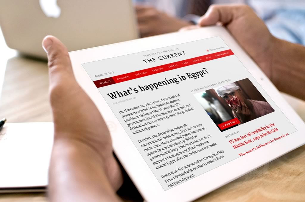
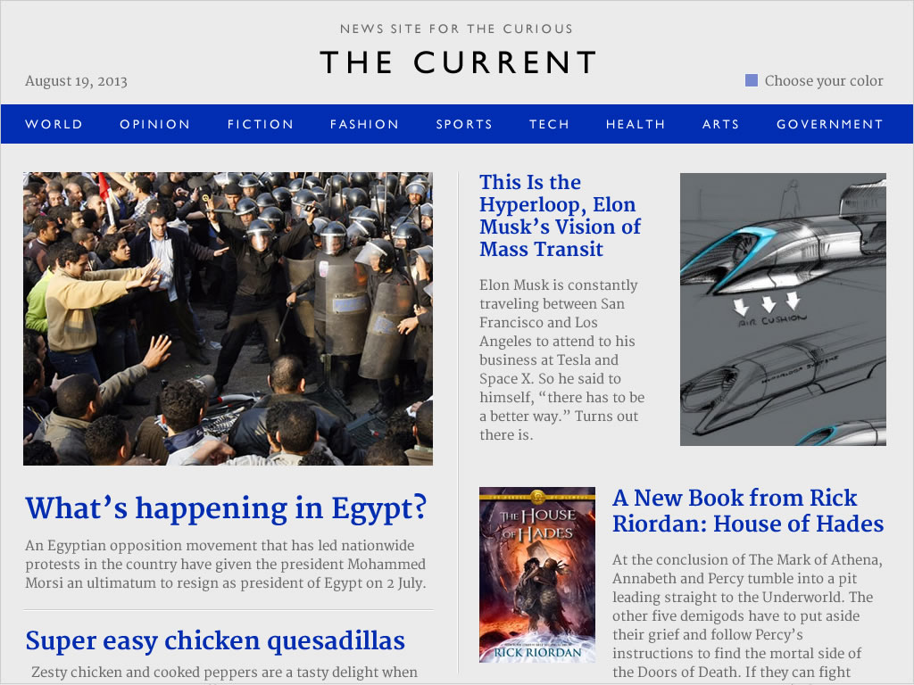
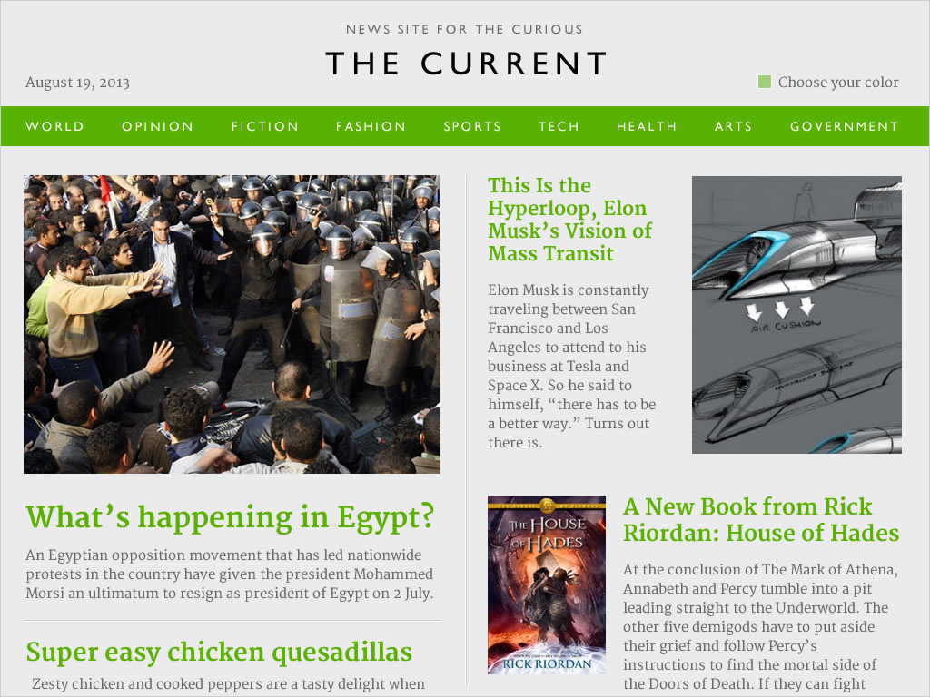
One of the features of the site would be the ability to change the accent color since we love customizing things. Here are three examples of different colors.
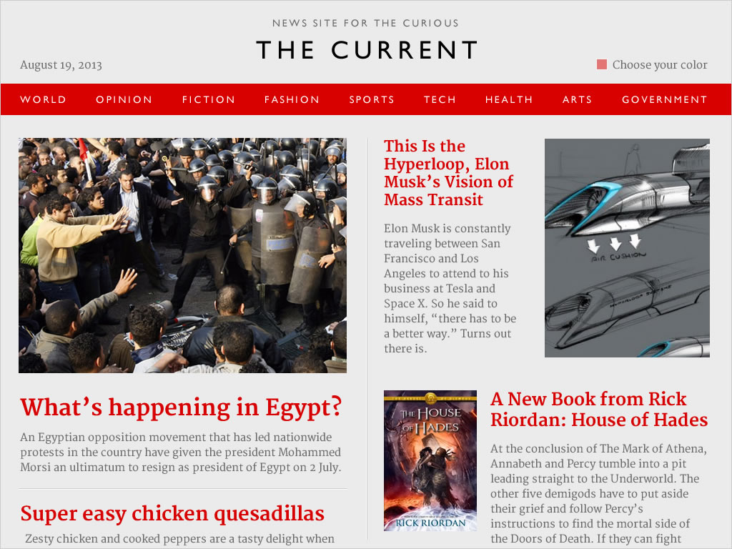
The article design straight on.
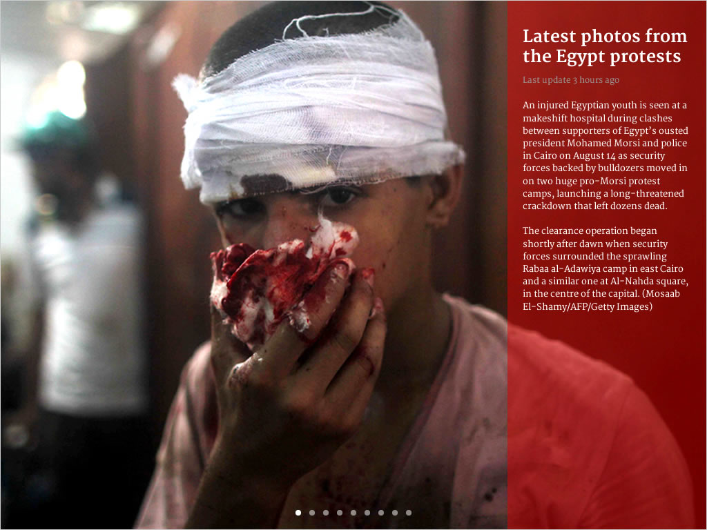
And lastly, the photo gallery view design.
Day 6: J.Crew Homepage
As I mentioned a few days ago (Day 2), I have a simple wardrobe. And in that wardrobe, majority of them come from two brands: Nike and J.Crew. I love their design, quality and price. And their curation of products matches my style, which makes shopping a lot easier. My tastes may change in the future but right now my choices from those two brands are great.
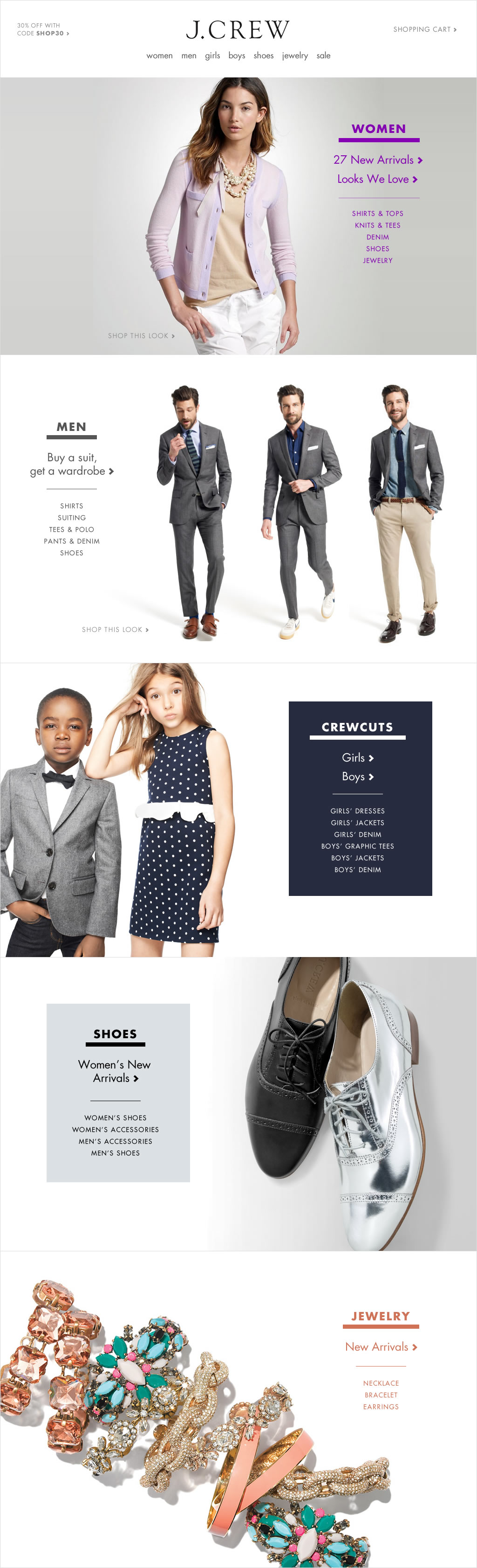
Today's exercise is a redesign of J.Crew's homepage. I've noticed that most retail homepages use carousels to showcase different collections or items on their website. I wanted to approach the homepage as a long, scrolling page using their current content as much as I can. I also wanted to help the user dive deep into the collections by showing subcategories and features in each panel. I'm imagining subtle motion (fading in of images and text) to invite the visitor to interact with the content.
A disclaimer: Logo, images, and trademarks are owned by J.Crew. This is a design exercise for my own learning.
Day 5: Medico
Several years ago, my dad was going to emergency rooms and hospitals a lot. My brother and I took turns taking him to different places. You might think I'm exaggerating this but every single time we made a visit, I would fill out medical forms (same questions every time) and then have to re-tell what I wrote to two or three or sometimes four people. Every. Single. Time. It was stressful and exhausting. You can see I've been stewing on this idea ever since that happened.
So, how can you share your up-to-date medical history with the right people? There are a few things that are needed in order for this to work well. First, the patient has to be in control of the medical data, not the medical institution or the government, because privacy is key. Second, the patient has to be in control of the access, meaning they can allow or revoke access to their medical data. This also means they can give access to family members, partners, doctors, and specialists. If I switch doctors, I can revoke access from the first doctor. It's like OAuth for my medical data. Third, the patient has to see the history of the access. They have to see who, when and where someone accessed the medical data. And lastly, it has to be mobile. No explanation needed.
(Side note: According to the CDC, there have been 265.6 MILLION hospital and emergency room visits in the U.S. in the last year. Source)
The technical challenge here is how and where this data is hosted. I'm not sure yet how to accomplish this. I'm not a security professional so this is hard for me to answer.
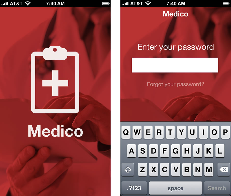
The design is also a challenge because it has to look and feel legitimate and secure. What I've designed uses the most trusted color scheme in the medical field: red and white. Below you can see the splash screen and the login screen.
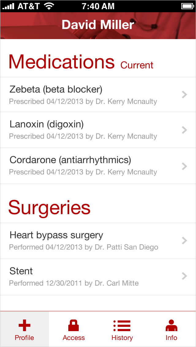
The page below is your medical profile, which shows medications and surgeries with dates of prescription or surgery, and by whom.
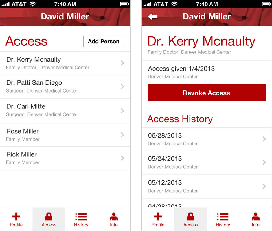
The flow below shows the list of people who have access to your profile and access history by each person. You can also revoke access if you would like from this flow.
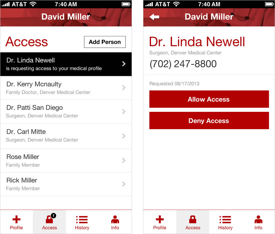
This last set of screen shows a notification when someone requests to access your file and gives you the choice to either allow or deny access.
The two other screens I didn't have time to design for are the History page, which shows your medical history (all the questions you answer on those medical forms), and the Info page, which shows your address, phone number, etc. that you have to provide in every visit.
Medical Clipboard designed by richard pasqua from The Noun Project
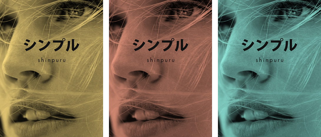
Day 4: Shinpuru
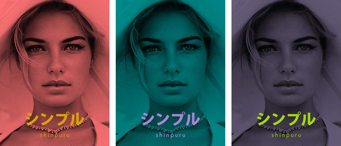
Today's design is all about color. I wanted to explore color in a way I've never done before. I decided to create a fictitious luxury brand called Shinpuru, which means simple in Japanese. Why a luxury brand? I've always been fascinated how the level of design and sophistication of luxury brands is so different from the everyday products I use. Designing a luxury brand pushes me to see beyond what I'm used to designing. I wanted to see how it changed the way I use color in a new context.
The first set of designs show a modern twist to luxury brand colors. I could have easily gone to the blacks and golds but the bright colors of the type is my approach to a younger but still sophisticated feel.
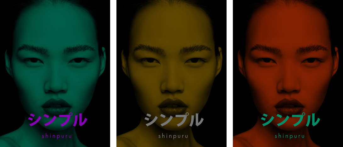
These next designs show a more muted color pallette with a simpler typeface color.
And here's a set with darker tones.
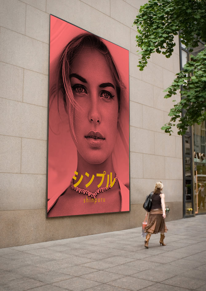
Here's how it would appear as a billboard.
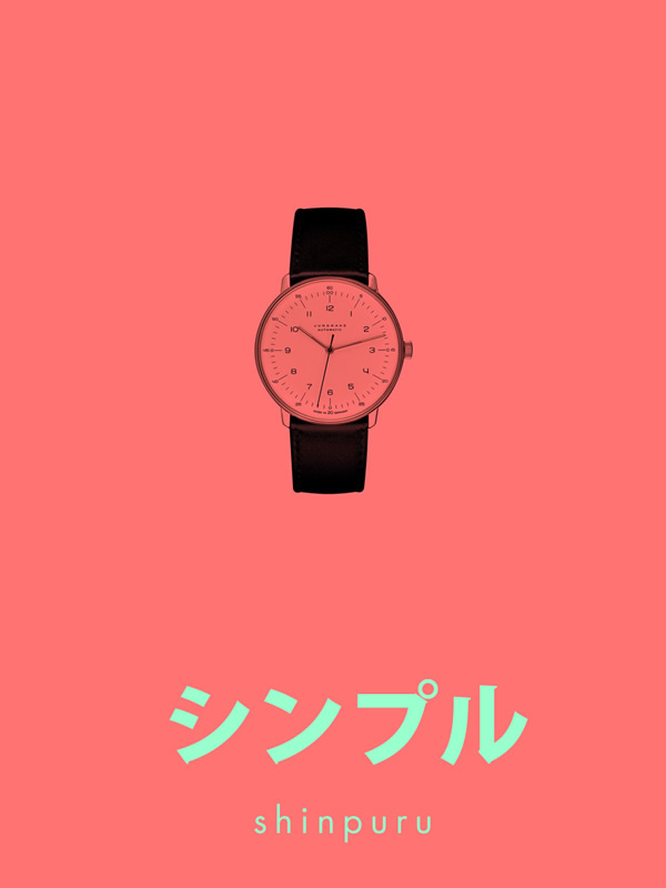
And lastly, a product shot with an even lighter color scheme than any of the designs above.
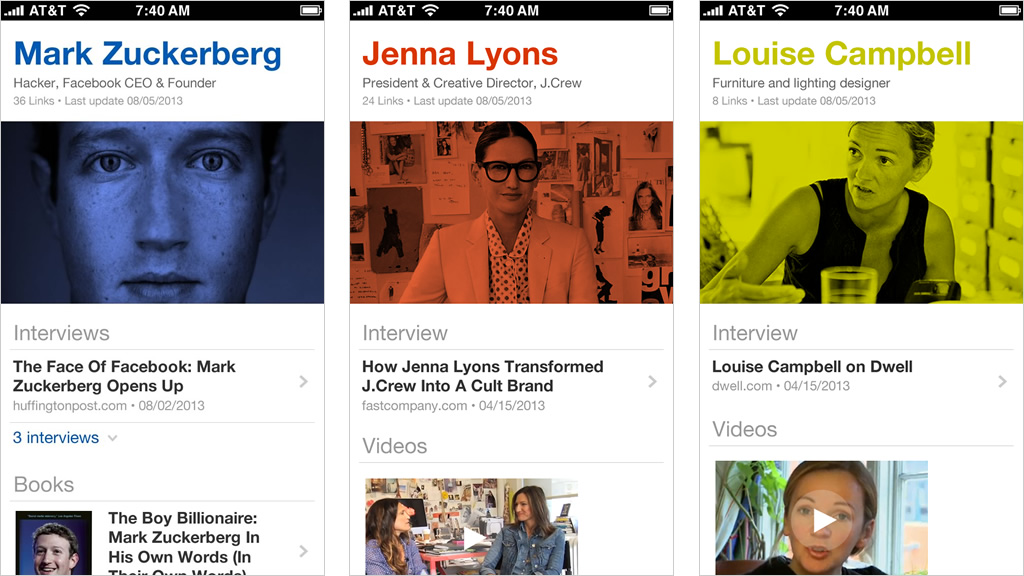
Day 3: Biographies Website
I love reading biographies. I've read a few books but I mostly read informal ones (interviews, profiles, Wikipedia, podcasts). I'm interested in stories of people's childhood, family, hometown, accomplishments and failures, decisions they've made, vision of the future, life-changing events, etc. Learning about people inspires me.
So, what if there was a page for each biography with the latest links to their interviews, videos, podcasts or books? It would be community-driven so links to interviews, videos, or books are up to date. People can also create biography pages and track the changes. “Why not just use Wikipedia?” Books, interviews, and podcasts contain stories that usually dive deeper than what you can find in Wikipedia. The references and links are also not well organized.
Here are three screens that show pages for Mark Zuckerberg, Jenna Lyons, and Louise Campbell. All are designed for small screens.
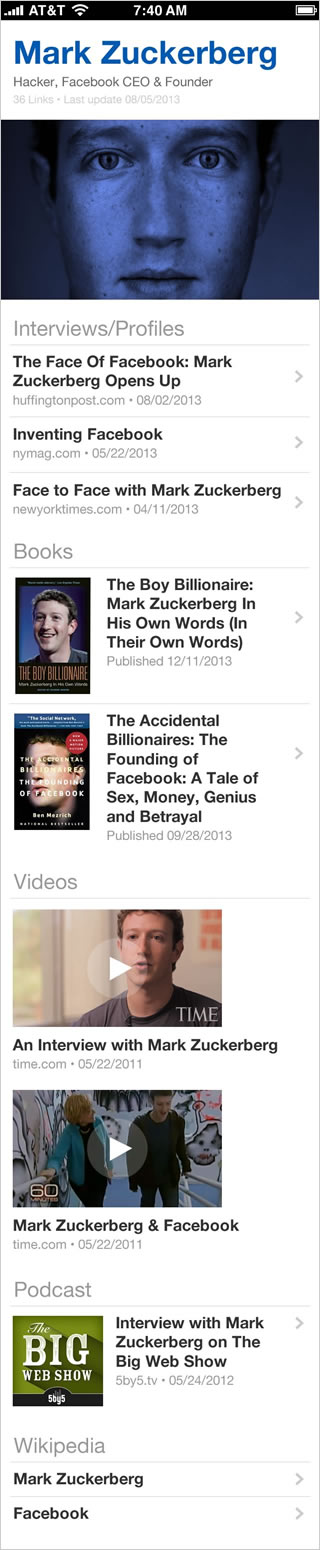
And here's a full page example of Mark Zuckerberg's bio.
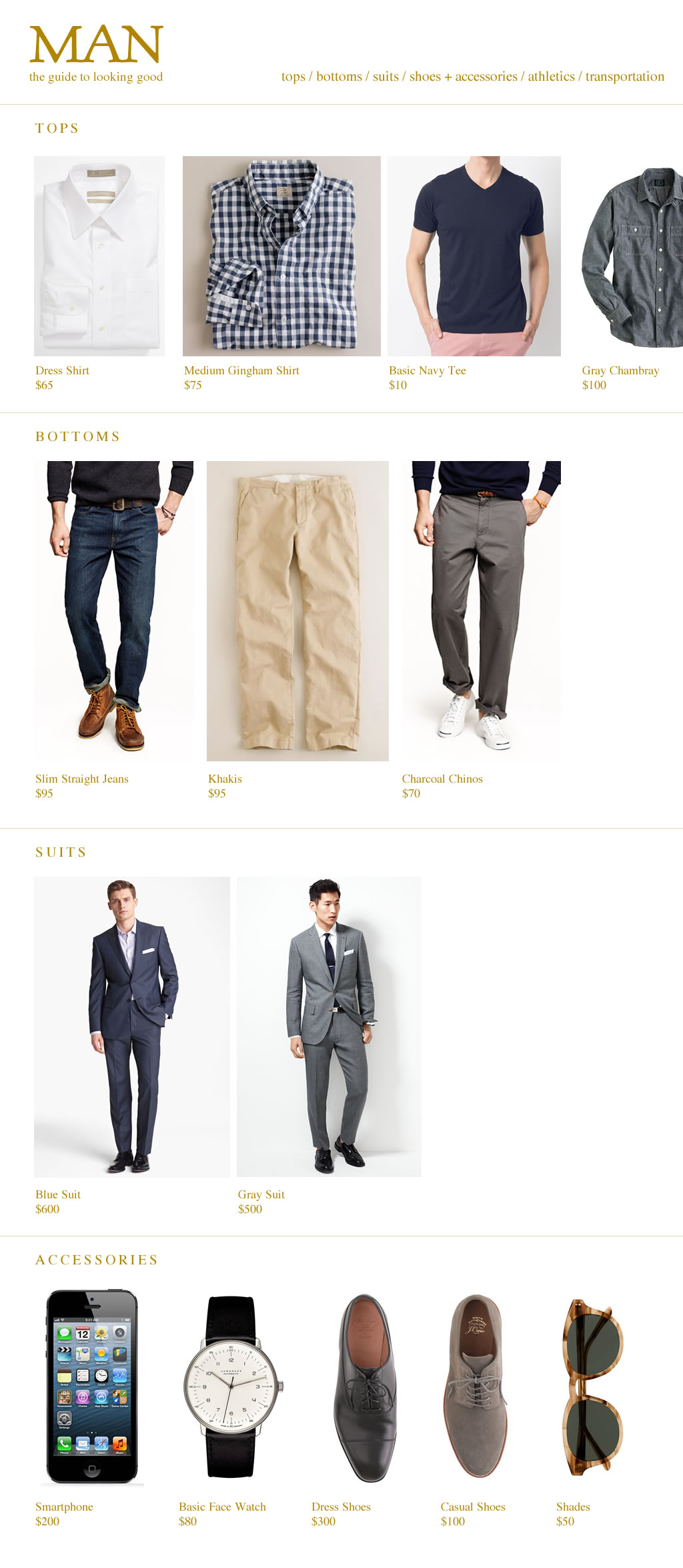
Day 2: Man, a website
“All it takes are a few simple outfits. And there's one secret – The Simpler, The Better.” — Cary Grant
I have a simple wardrobe, something that I worked on several years ago. It was an exercise of purging that made my life thankfully simpler. Because I only wanted to keep the minimum amount of clothes, I had to research and learn the finer ways to do this. I came across a book called The Handbook of Style from Esquire, which has been an inspiration to my purging and this idea.
The project below is a single-page site that lists the most essential wardrobe for a man. It's designed so each item could work with other items in the wardrobe. Each item would link to the proper online store, which I have chosen for quality and price. I have listed tops, bottoms, shoes, accessories, athletics, and transportation. However, because of time, I was not able to show everything I wanted but for now it's a start.
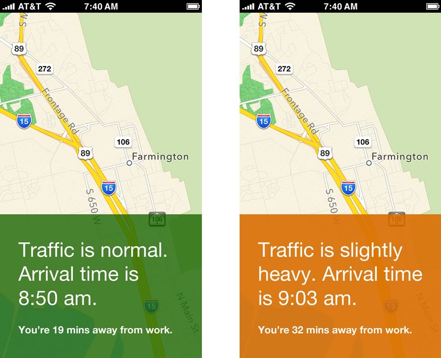
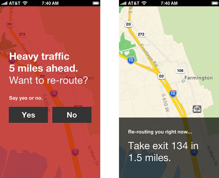
Day 1: Commute
My daily commute is planned: 19 mins, same entrance to the freeway, same exit, same side streets. After testing different routes, I've optimized my commute down to the minute. But sometimes accidents happen and because I don't always check the traffic before I leave the house or office, I find myself stuck on the road. How can this not happen again?
Commute is an app that tells me one thing: “there's traffic 5 miles ahead.” It learns my route one time including the usual time I leave the house and office, then from there it will always warn me if there's traffic ahead. If traffic is normal, it just stays quiet. That's it.
Why would someone use this app? Most of us daily commuters have our planned routes and we probably use the same route everyday. Commute is designed for this everyday planned commute.
Inspiration for Commute came from Dark Sky, an app that tells you if it will rain or snow up to an hour in advance. It tells you the near future and that is my hope with Commute.
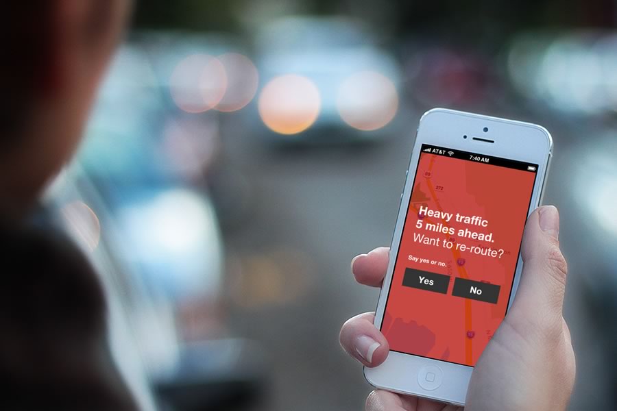
I wanted to create an interface that communicated quickly using only colors and typefaces. Red meant to take action, orange to warn, and green to keep going. I also wanted to use a clear typeface and a large font size because you need to quickly glance and keep your eyes on the road. I imagined that the app talks to you to prompt you when heavy traffic is ahead and help you re-route.
Below are screens on when traffic is normal or slightly heavy. It includes your arrival time and commute length.