Shinpuru
This project is Day #4 of 10 Designs in 10 Days. Check out all 10 projects.
Today's design is all about color. I wanted to explore color in a way I've never done before. I decided to create a fictitious luxury brand called Shinpuru, which means simple in Japanese. Why a luxury brand? I've always been fascinated how the level of design and sophistication of luxury brands is so different from the everyday products I use. Designing a luxury brand pushes me to see beyond what I'm used to designing. I wanted to see how it changed the way I use color in a new context.
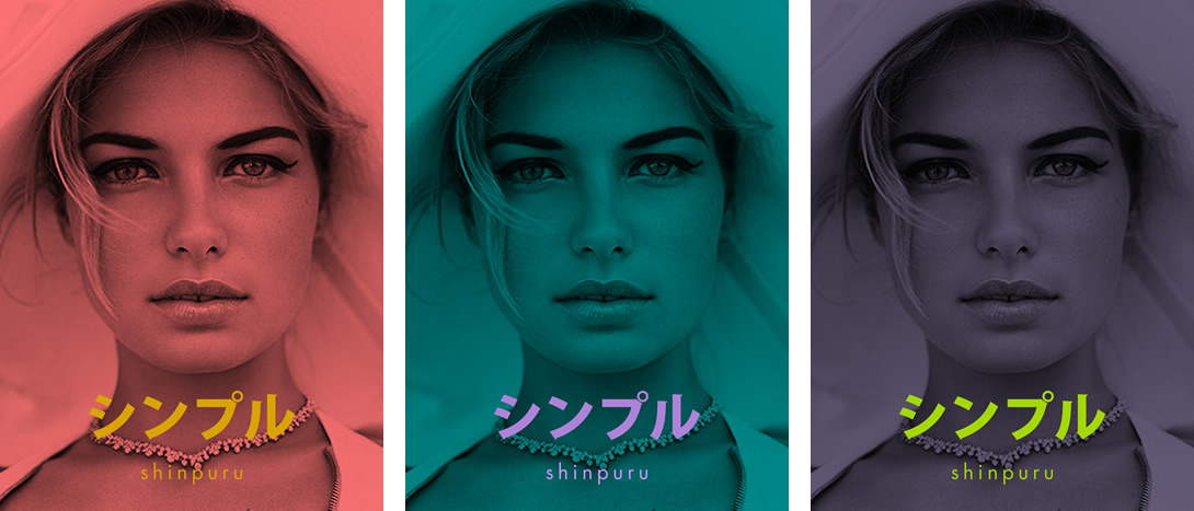
The first set of designs show a modern twist to luxury brand colors. I could have easily gone to the blacks and golds but the bright colors of the type is my approach to a younger but still sophisticated feel.
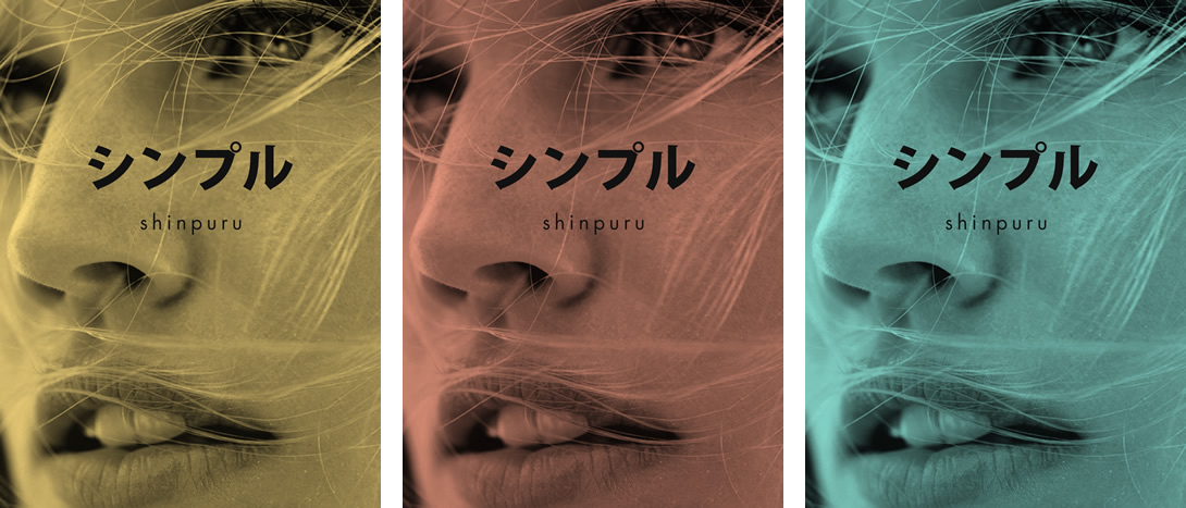
These next designs show a more muted color pallette with a simpler typeface color.
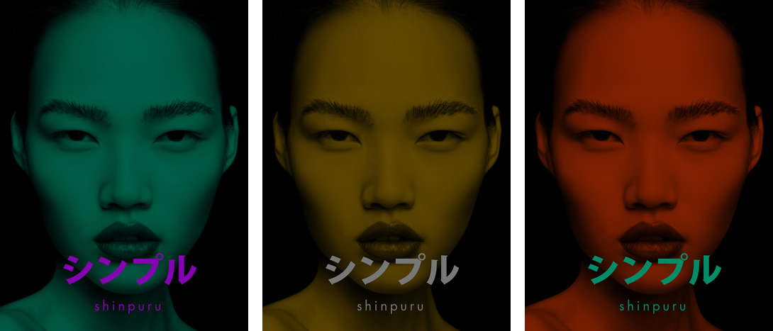
And here's a set with darker tones.
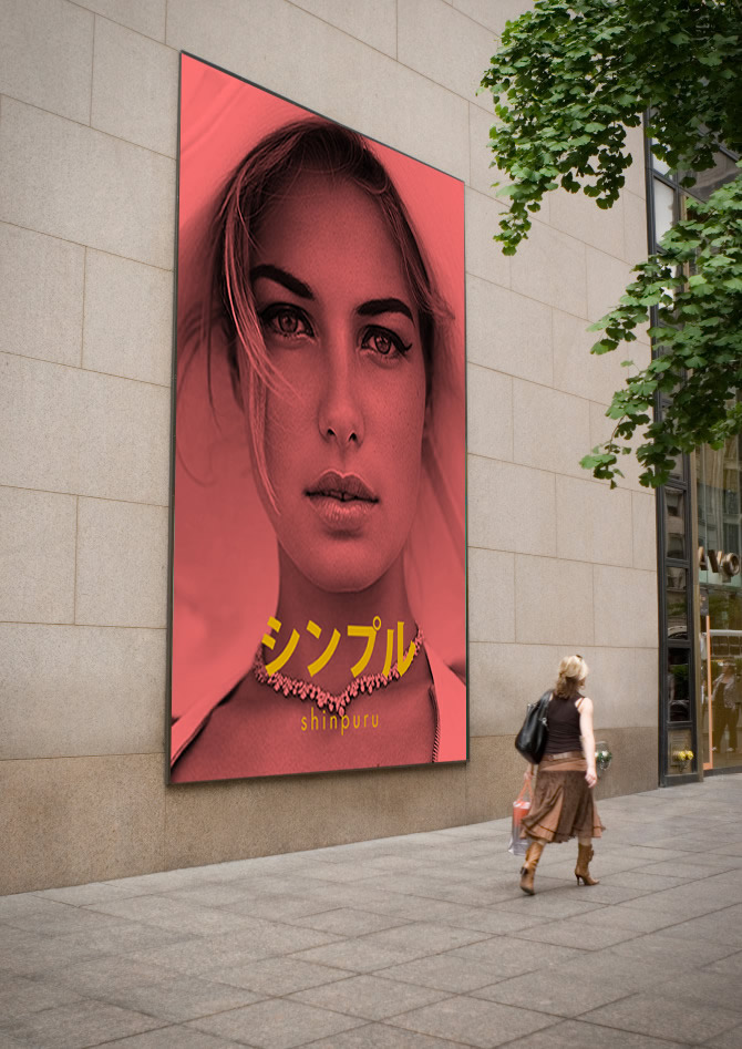
Here's how it would appear as a billboard.
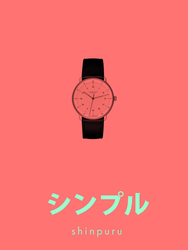
And lastly, a product shot with an even lighter color scheme than any of the designs above.